The Engineering Advantage of Material UI: Consistency, Accessibility, and Rapid Prototyping
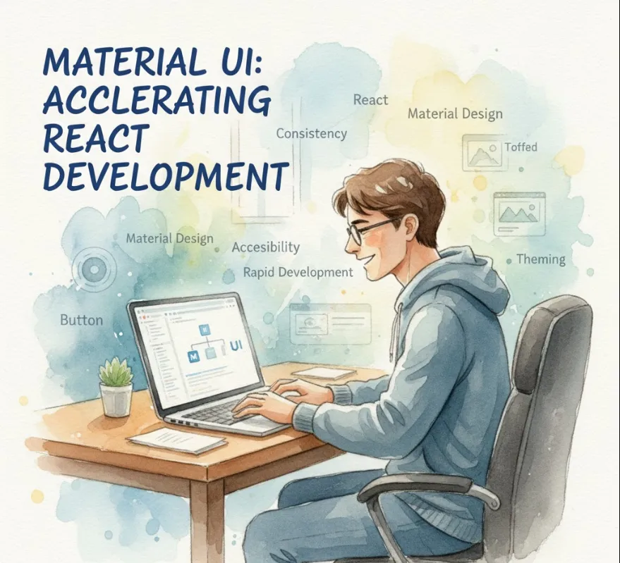
Material UI is a comprehensive library of React UI components that faithfully implements Google's Material Design.
MUI provides significant advantages that accelerate development and improve code quality
Rapid Development & Consistency
It offers a huge collection of pre-built, high-quality components (like Buttons, TextFields, Modals, etc.). This means you spend less time styling and more time on application logic. Since all components adhere to the Material Design guidelines, your application automatically achieves a consistent, professional, and familiar look and feel.
High-Quality & Accessibility
MUI components are meticulously crafted, responsive, and follow accessibility best practices (WCAG standards) right out of the box. This saves engineers the complex work of ensuring things like keyboard navigation and ARIA attributes are correctly implemented.
Customization
While it follows Material Design, MUI is highly flexible. You can easily customize the theme (colors, typography, spacing) globally across your entire application, or override styles for individual components. This allows you to match your company's branding while keeping the benefits of the pre-built components.
Excellent Documentation & Community
The documentation is thorough, easy to navigate, and includes numerous examples. Because it's one of the most popular React UI libraries, finding solutions to problems via the large community is very easy.
Adding Material UI to your React project is straightforward.
You typically need the core @mui/material package, and often the separate @emotion/react and @emotion/styled packages for styling (MUI uses Emotion under the hood for a modern styling system).
# Using npm
npm install @mui/material @emotion/react @emotion/styled

# Using yarn
yarn add @mui/material @emotion/react @emotion/styled
Material Design relies on the Roboto font. To ensure components look correct, you should include it in your index.html (or equivalent file).
<link
  rel="stylesheet"
  href="https://fonts.googleapis.com/css?family=Roboto:300,400,500,700&display=swap"
/>
Here are a few basic examples demonstrating how easy it is to use MUI components.
You import components directly from @mui/material and use them like standard React components.
import React from 'react';
import { Button, Typography, Container } from '@mui/material';

function MySimplePage() {
  const handleClick = () => {
    alert('Button clicked!');
  };

  return (
    // Container helps center content and apply padding
    <Container maxWidth="sm">
      <Typography variant="h4" component="h1" gutterBottom>
        Welcome to My MUI App
      </Typography>
      <Typography variant="body1" paragraph>
        This is a paragraph styled with Material UI's Typography component.
      </Typography>
      <Button
        variant="contained" // Filled background button
        color="primary"      // Uses the primary theme color
        onClick={handleClick}
      >
        Click Me
      </Button>
      <Button
        variant="outlined"  // Bordered button
        color="secondary"
        style={{ marginLeft: 8 }}
      >
        Learn More
      </Button>
    </Container>
  );
}

export default MySimplePage;
You can wrap your application with the <ThemeProvider> component to set a global theme.
import React from 'react';
import { createTheme, ThemeProvider } from '@mui/material/styles';
import { Button } from '@mui/material';

// 1. Create your custom theme
const customTheme = createTheme({
  palette: {
    // Override the primary color to a custom purple
    primary: {
      main: '#5E35B1', // Deep Purple 600
    },
    // Set a custom secondary color
    secondary: {
      main: '#FF7043', // Deep Orange 400
    },
  },
  typography: {
    // Custom font size for all h1 tags
    h1: {
      fontSize: '2.5rem',
    },
  },
});

function MyApp() {
  return (
    // 2. Wrap your entire application or a section with ThemeProvider
    <ThemeProvider theme={customTheme}>
      <Button variant="contained" color="primary">
        Primary Purple Button
      </Button>
      <Button variant="contained" color="secondary" style={{ marginLeft: 8 }}>
        Secondary Orange Button
      </Button>
    </ThemeProvider>
  );
}

export default MyApp;
This is just the tip of the iceberg! MUI offers sophisticated components like Data Grids, Date Pickers, and comprehensive layout utilities that make building complex, production-ready UIs much faster.